
Core UI
Build the experience. Not the same interface twice.
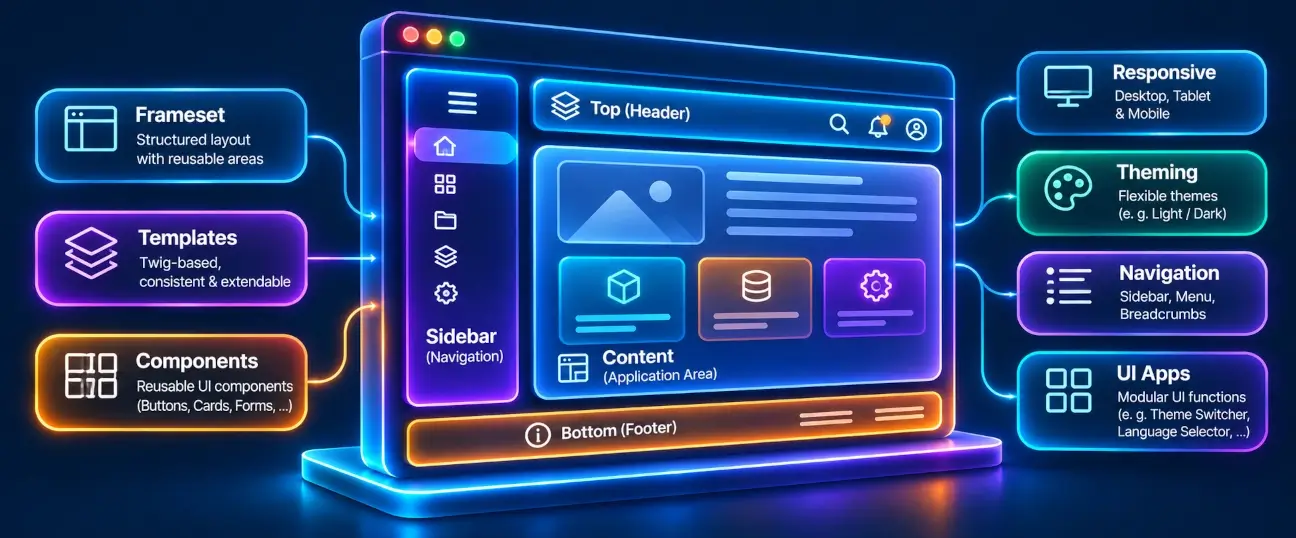
Great business software deserves an interface that feels familiar, works across devices and remains easy to maintain. APPNETOS Core UI provides reusable presentation elements that help applications deliver consistent navigation and interface behavior without recreating the same frontend building blocks for every project.
What is Core UI?
Core UI is the collection of reusable user-interface elements provided by the APPNETOS Core. These components focus on presentation and interaction: they accept application-provided data, prepare it for rendering and produce HTML through the APPNETOS template and rendering infrastructure.
Rather than defining the business processes of an application, Core UI supplies the building blocks used to present those processes. Applications remain responsible for their routes, permissions, data and domain-specific behavior.
Core UI is not a standalone application or a replacement for an application's frontend. It is a shared foundation that applications can use and customize.
One interface foundation. Many applications.
Every new application introduces familiar frontend requirements: navigation, responsive layouts, active states and consistent visual feedback. Reimplementing these details across projects creates unnecessary maintenance work and makes it harder to provide a coherent experience.
APPNETOS Core UI keeps common presentation patterns close to the Core while leaving each application in control of its own structure and appearance.
Reuse instead of rebuild
Start with shared interface elements rather than recreating familiar markup and behavior in every application.
Consistency without rigidity
Keep recurring interaction patterns recognizable while adapting templates and styles to individual applications.
Maintain once, benefit broadly
Centralize common interface implementations so supported improvements can be shared across consuming applications.
Designed for responsive business software
APPNETOS Core UI elements can provide responsive behavior through their supported Bootstrap templates. The navigation sidebar, for example, presents hierarchical navigation on larger screens and uses Bootstrap's collapse behavior on smaller screens.
That responsive foundation reduces repetitive frontend work without restricting applications to a single fixed layout. The surrounding page structure, content and branding remain under application control.
Bootstrap-ready. Adaptable by design.
Core UI separates component data and rendering logic from the framework-specific markup used to display it. Components can select a template matching the Bootstrap version configured in APPNETOS, provided that version is explicitly supported by the component.
This approach makes it possible to maintain distinct template variants as frontend frameworks evolve. It does not imply that every Bootstrap release is automatically supported: compatibility is defined by the individual Core UI component.
Version-aware templates
Use component templates built for explicitly supported Bootstrap versions instead of relying on implicit markup compatibility.
Your design, your templates
Use the APPNETOS file-resolution and template-override mechanisms to tailor presentation to your application.
Integrated with the APPNETOS Core
Core UI elements build on established APPNETOS services instead of introducing a separate rendering system. Depending on the component, they use the shared registry, file resolution, CSS registration and Twig rendering pipeline to prepare and display interface elements.
For example, the Sidebar component normalizes application-supplied navigation entries, registers its stylesheet and renders the resulting structure through a version-specific Twig template. Applications can supply a custom template where the component supports it.
Explore the underlying Rendering & UI documentation for the wider Core rendering architecture.
Core UI and Core Apps: complementary building blocks
Core UI and Core Apps solve related but different problems. Core UI focuses on reusable interface elements and their presentation. Core Apps provide more complete application features that can combine controllers, business-oriented workflows, templates, translations and frontend resources.
A Core App may use Core UI elements as part of its interface, while an application can also integrate Core UI directly. Both belong to the shared APPNETOS foundation, but neither replaces the other.
For feature-oriented components, continue with Core Apps.
Build once. Make every interface better.
APPNETOS Core UI is designed to grow alongside the applications that use it. Shared presentation patterns can evolve centrally while applications retain ownership of their unique workflows and visual identity.
One Core. Unlimited Business Software.
Bootstrap-aware Core UI development
Learn how to isolate framework-dependent templates and develop compatible components: Bootstrap Template Versioning and Developing Core UI Elements.