
FieldBuilder
Build reusable Bootstrap form controls and content elements from declarative PHP arrays.
CoreUi\Form\FieldBuilder validates and normalizes element definitions and renders their HTML
through the shared APPNETOS Twig rendering system. It is a UI builder, not a form submission or
persistence service. Core UI elements do not provide their own translations.
Rendering architecture
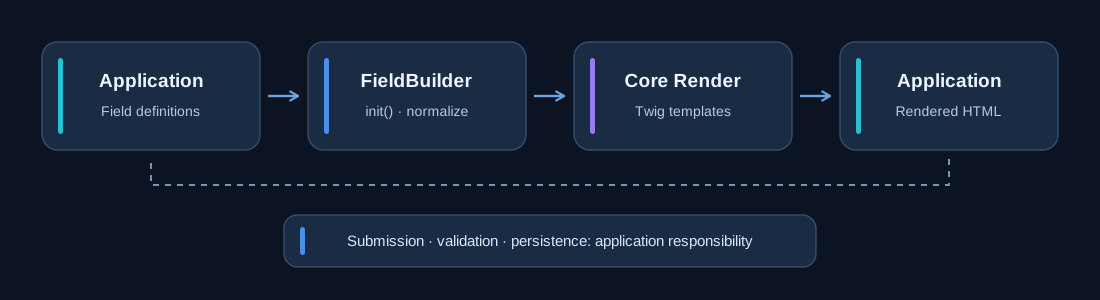
Call init($items) to validate and normalize the keyed definitions. Call
getView()
to render HTML. Rendering is cached until init() is called again.
getItems()
exposes the normalized definitions.
Quick start
Define elements with stable string keys. Form fields require a type, name
and
label; content elements have their own required properties.
$builder = Registry::getNew(\CoreUi\Form\FieldBuilder::class);

$builder->init([
    'title' => [
        'type' => 'heading',
        'label' => 'Profile',
        'level' => 3,
    ],
    'username' => [
        'type' => 'text',
        'name' => 'username',
        'label' => 'Username',
        'value' => $username,
        'required' => true,
    ],
    'email' => [
        'type' => 'email',
        'name' => 'email',
        'label' => 'Email address',
        'error' => $emailError,
    ],
]);

$fieldsHtml = $builder->getView();
Embed $fieldsHtml in an application-owned <form> and handle the
request,
validation, authorization and persistence in your own controller. APPNETOS Create User, Create
Group,
Edit User and Edit Group demonstrate this integration pattern.
Supported element types
| Category | Types | Purpose |
|---|---|---|
| Text input | text, email, password, number,
hidden
|
Single-value inputs |
| Extended input | textarea, checkbox |
Multiline and boolean controls |
| Choice input | radio, checkbox-group, select |
Controls requiring non-empty options |
| Content | heading, paragraph, link, button
|
Supporting form content and actions |
Field definition reference
| Property | Behavior |
|---|---|
type |
Required; one of the supported types. |
name, label |
Required non-empty strings for form fields. |
id |
Defaults to name. |
placeholder |
Defaults to label; may be null. |
help, error |
Optional help and error text for template display; not server-side validation. |
value |
Optional current value; defaults to null. |
required |
Boolean, defaults to false. |
class |
Optional CSS class string. |
attributes |
Additional HTML attributes, normalized by the builder. |
options |
Required non-empty list for radio, checkbox-group and
select.
|
Each option requires a non-empty string value and label. Optional option
properties are disabled, class and attributes.
'role' => [
    'type' => 'select',
    'name' => 'role',
    'label' => 'Role',
    'options' => [
        ['value' => 'editor', 'label' => 'Editor'],
        ['value' => 'viewer', 'label' => 'Viewer', 'disabled' => true],
    ],
],
Content element properties
| Type | Required properties | Additional properties |
|---|---|---|
heading |
label |
level (1–6; defaults to 3) |
paragraph |
text |
— |
link |
label, href |
— |
button |
label |
— |
All content types also accept class and attributes. Invalid heading levels
fall
back to level 3.
Validation and errors
Malformed element definitions, unsupported types, missing required properties and invalid selection
options raise CoreUi\Form\FieldBuilder\Exception\FieldBuilderException during
normalization. The error field property is presentation data: application logic must
validate submitted input and supply the corresponding message.
Templates and customization
The builder uses the shared APPNETOS Core\Render controller to render field-builder.html.twig,
which includes one template per element type. The implementation resolves the Bootstrap template
directory through Core\Ui; the current mapping supports
BootstrapVersion::V5_3_8 via the bootstrap/5.3 directory. Bootstrap must
be
enabled.
Shared template root: appnetos/shared/ui/form/field-builder/templates/bootstrap/5.3/.
Adapt
templates through the APPNETOS template override mechanism rather than editing the shared Core UI
source. FieldBuilder itself does not provide translations; pass already localized labels and
messages
from the application when required.